keith
Cool off California
Role
UX DesignerFigma Lead
Team
Steven Won • Carlos Martinez • Yvonne Liu • Wilson Chen • Anahi Segoviano-Silva
Timeframe
Summer 2022
Managers
Steven Won • Carlos Martinez • Yvonne Liu • Wilson Chen • Anahi Segoviano-Silva
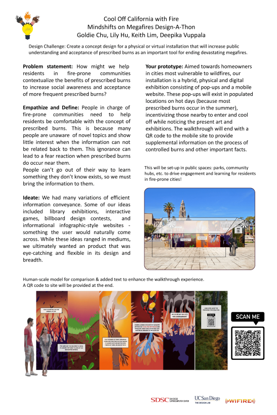
Problem Statement
In partnership with the San Diego Supercomputer Center and WIFIRE, Mindshifts on Megafire is a 6-hour design challenge hosted by UCSD’s The Design Lab. Participating students design concepts of installations with the goal of increasing public understanding and acceptance of prescribed burns as an important tool for ending wildfires.
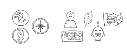
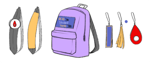
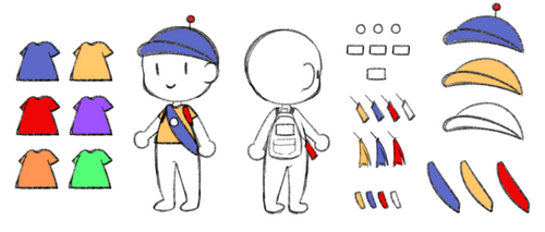
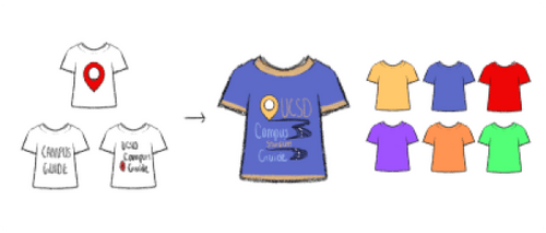
Initial Project
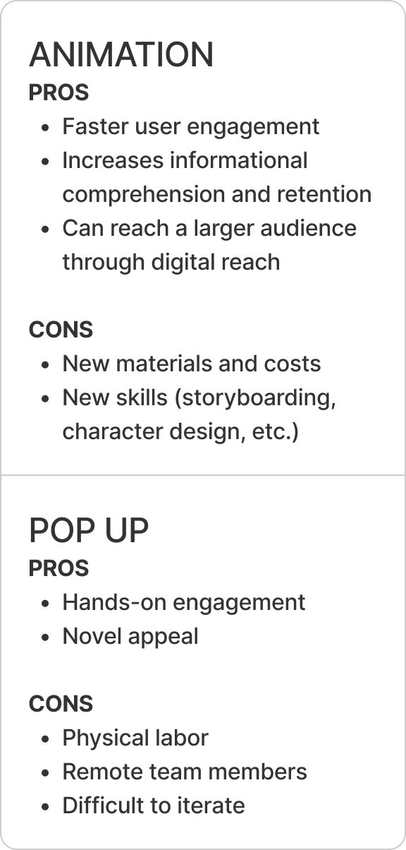
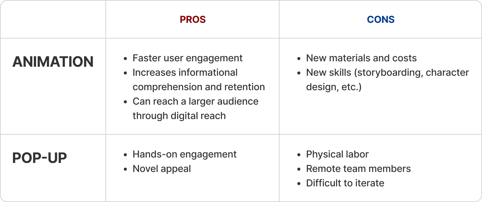
Now, to the fun part of this project: testing for the most effective artifact! We considered every potential artifact, then eliminated those with obvious constraints. This included sketches the various artifacts and forming a table to discuss their various pros and cons to their features.
Post-Project Reflection
While the pop-up was a unique approach, our team worried about its practicality and effectiveness.
To probe for potential issues, we interviewed 4 users through a digital simulation of our installation. Having them engage with a Figma prototype of the pop-up, we examined how likely they would:
- Approach our physical installation in the wild, and
- Scan the QR code to examine our mobile website.
Gauging how much users would interact with the prototype, and identifying the best contexts of attraction, we unveiled these key takeaways:
1
User's likelihood to approach depends on availability
-> The experience must be shorter than 5 minutes
2
Users are unlikely to read heavy text
-> The delivery must be brief but memorable
3
Users are likely to stop if something catches their attention
-> Installation must stand out
Transitioning
Following our testing and feedback sessions, the team gathered secondary research to find strategies already proven to capture and engage user attention. We notes that people retained visual information over written information, and that animated pictures elicited greater motivational attraction than still images. After making a pros and cons list, we decided to take the chance to animate a PSA rather than installing an informational mural.
Expert Knowledge
Our team met with burn bosses for a Q&A sessions. During this, we gained an in-depth understanding prescribed burns and their execution, safety, risks, and impact. We also explored why negative public reception and pushback occurs.
These interviews lent to our problem statement as it allowed us to discover that education and anxiety reduction was truly the solution to increasing prescribed burn social awareness and acceptance.
Animation
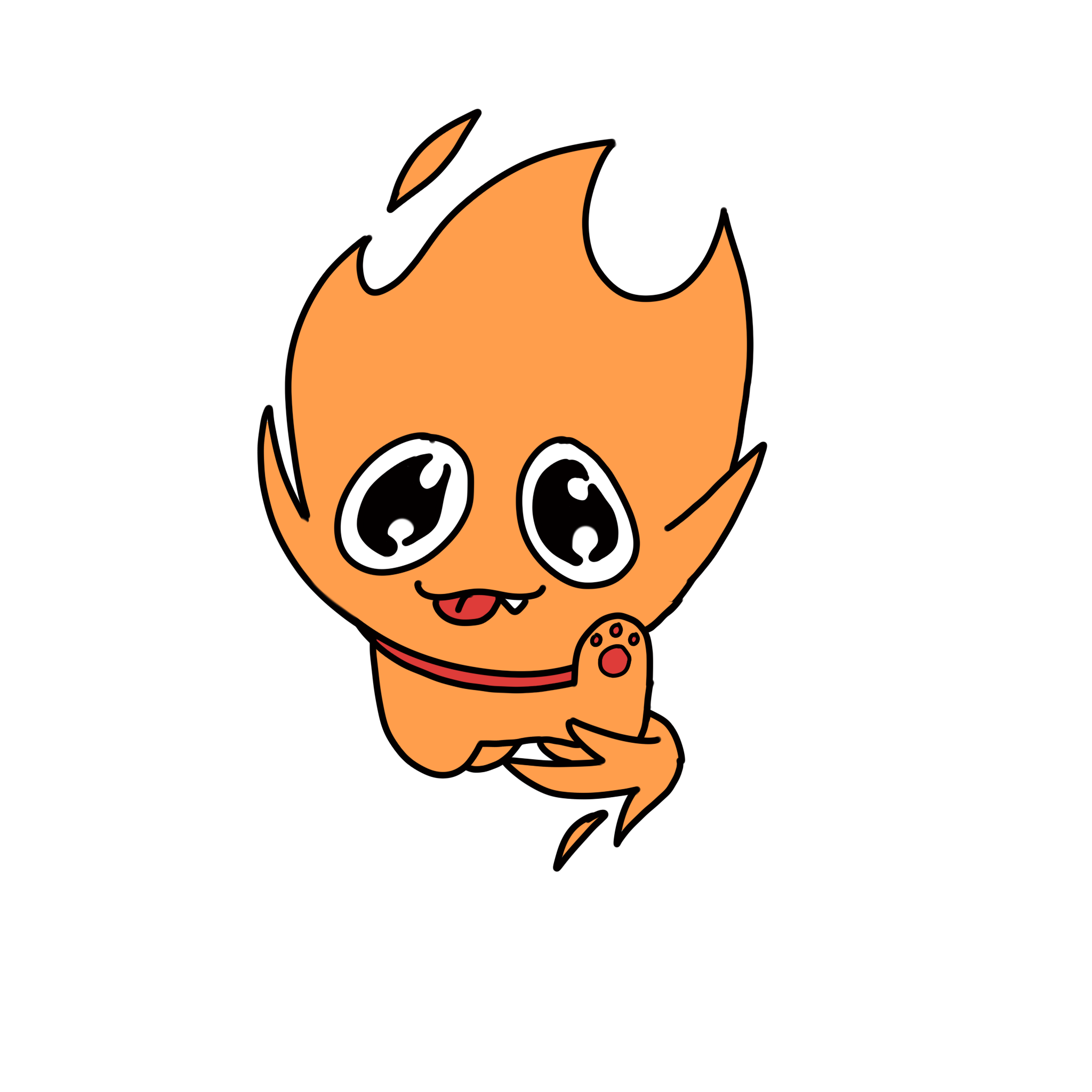
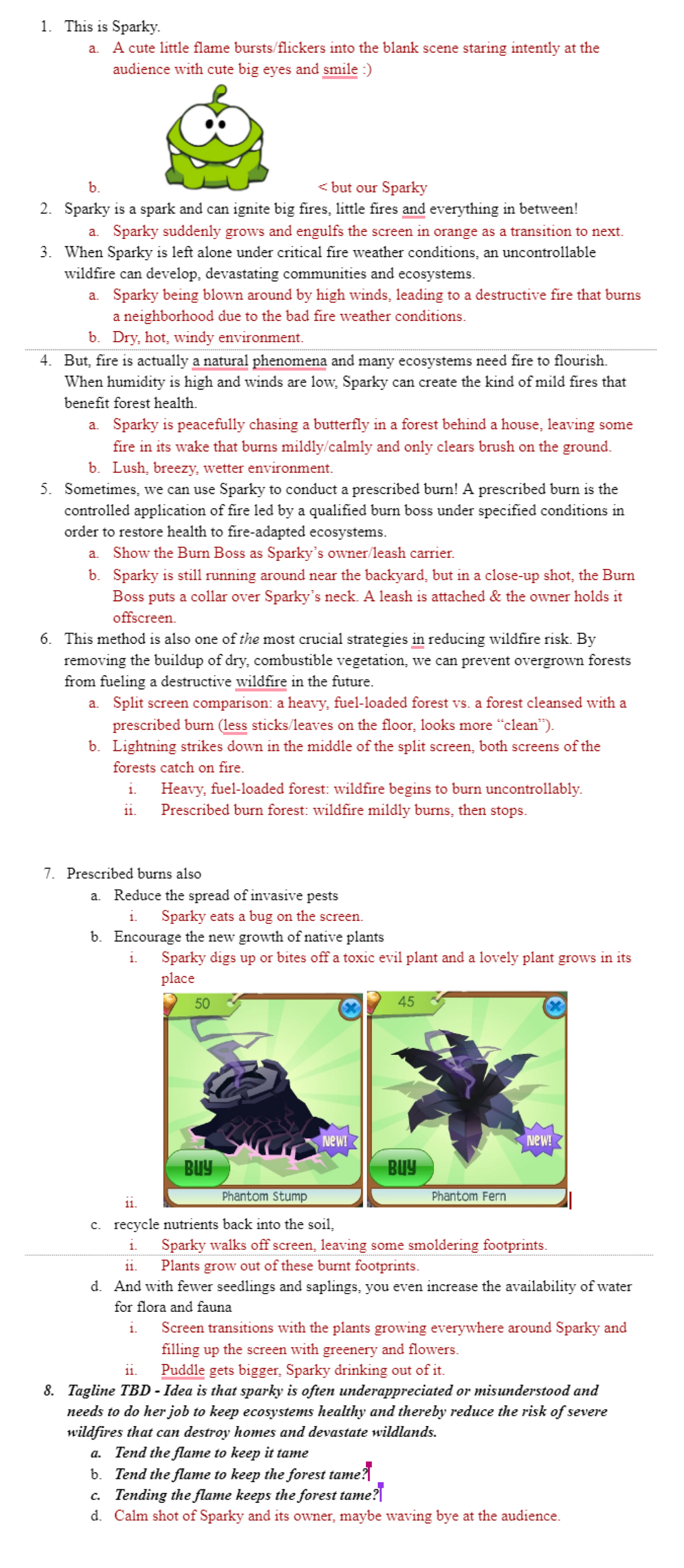
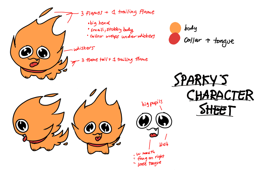
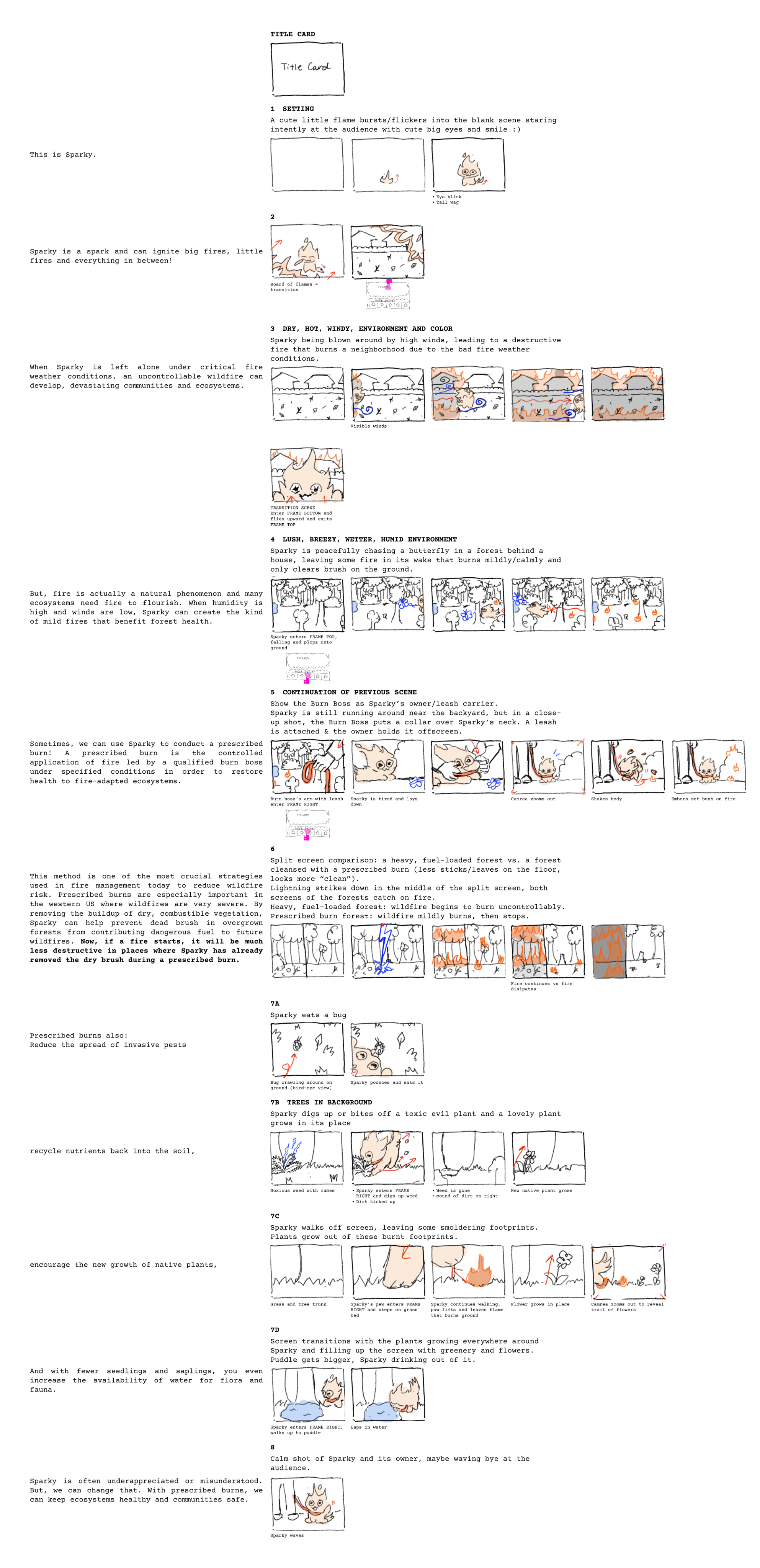
The first component of our exhibit remains as the initial exposure to our whole exhibit, introducing the audience to prescribed burns. During ideation, we individually drafted our own mascots and stories. While I participated in the process of drafting the final story and mascot, Sparky, most of my effort went into organizing this information for our animator.
Story Outline
Character Sheet
Storyboard
Website
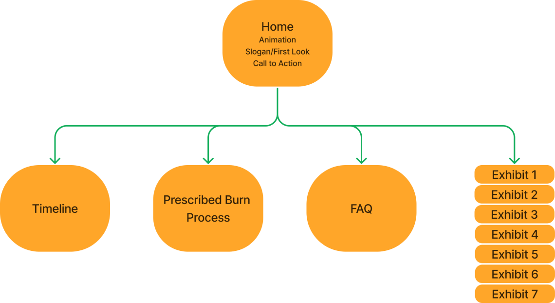
Our website remained the same in its purpose as a post-animation educational step. Now that an animation will introduce users through a digital setting, we are prioritizing a desktop website along with the mobile platform. While the animation introduces prescribed burns, the website provides the history and steps of the process and an FAQ for further curiosities. The website also acts as a central hub to showcase the other winning teams and their exhibits. Ultimately, this second half of our exhibit teaches the technical information to our users, alleviating the anxieties surrounding prescribed burns.
Mood Board
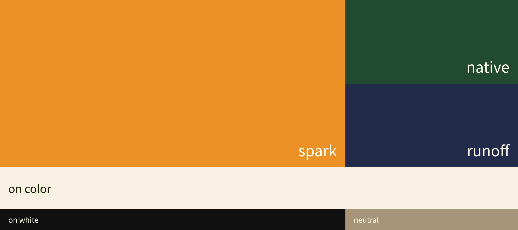
Color Styles
Figma Sandbox
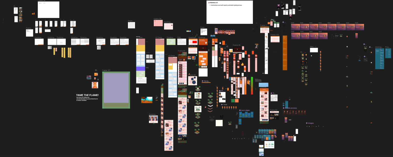
Each team member iterated on different website structures, both desktop and mobile. The screenshot below is a sandbox of all of the ideas and iterations throughout our project.
Limitations
Lack of user Testing
Due to time constraints and our multi-faceted project, our team could not conduct formal user tests
->
Got Feedback
Held weekly meetings with project managers to asssedss website quality and referenced existing infromationm sites
Lack of Exhibit Section
Getting in touch with other teams was lacking or scarce; requests for project descriptions and images were not fulfilled
->
Created a Template
Held weekly meetings with project managers to asssedss website quality and referenced existing infromationm sites
Reflection
More Straps, Please
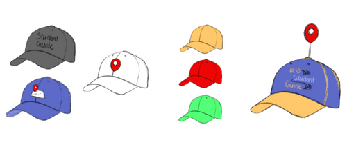
One notable issue with the strap sleeve is obstruction when the wearer had it opposite to the person trying to find them. To improve its features, a sleeve on both straps would prove much more effective than one, essentially making the sleeves visible from both sides of the guide rather than just one.
Testing the strap sleeve further with plenty more user tests would also be helpful since we only tested on 20 people total.
Beyond the Technical
This particular project taught me the possibilities of UX outside of digital iterations that I commonly resort to in other projects. As we explored and iterated, concepts beside digital ones captured our attentions, and to then reframe our minds to avoid the typical route led to interesting and effective prototypes.
keith
Cool off California
Role
UX DesignerFigma Lead
Team
Goldie Chu • Lily Hu • Benjamin Tran
Timeframe
Summer 2022
Managers
Melissa Floca • Rukmini R.
Problem Statement
In partnership with the San Diego Supercomputer Center and WIFIRE, Mindshifts on Megafire is a 6-hour design challenge hosted by UCSD’s The Design Lab. Participating students design concepts of installations with the goal of increasing public understanding and acceptance of prescribed burns as an important tool for ending wildfires.
Initial Project
Now, to the fun part of this project: testing for the most effective artifact! We considered every potential artifact, then eliminated those with obvious constraints. This included sketches the various artifacts and forming a table to discuss their various pros and cons to their features.
Post-Project Reflection
While the pop-up was a unique approach, our team worried about its practicality and effectiveness.
To probe for potential issues, we interviewed 4 users through a digital simulation of our installation. Having them engage with a Figma prototype of the pop-up, we examined how likely they would:
- Approach our physical installation in the wild, and
- Scan the QR code to examine our mobile website.
Gauging how much users would interact with the prototype, and identifying the best contexts of attraction, we unveiled these key takeaways:
1
User's likelihood to approach depends on availability
-> The experience must be shorter than 5 minutes
2
Users are unlikely to read heavy text
-> The delivery must be brief but memorable
3
Users are likely to stop if something catches their attention
-> Installation must stand out
Transitioning
Following our testing and feedback sessions, the team gathered secondary research to find strategies already proven to capture and engage user attention. We notes that people retained visual information over written information, and that animated pictures elicited greater motivational attraction than still images. After making a pros and cons list, we decided to take the chance to animate a PSA rather than installing an informational mural.
Expert Knowledge
Our team met with burn bosses for a Q&A sessions. During this, we gained an in-depth understanding prescribed burns and their execution, safety, risks, and impact. We also explored why negative public reception and pushback occurs.
These interviews lent to our problem statement as it allowed us to discover that education and anxiety reduction was truly the solution to increasing prescribed burn social awareness and acceptance.
Animation
The first component of our exhibit remains as the initial exposure to our whole exhibit, introducing the audience to prescribed burns. During ideation, we individually drafted our own mascots and stories. While I participated in the process of drafting the final story and mascot, Sparky, most of my effort went into organizing this information for our animator.
Story Outline
Character Sheet
Storyboard
Website
Our website remained the same in its purpose as a post-animation educational step. Now that an animation will introduce users through a digital setting, we are prioritizing a desktop website along with the mobile platform. While the animation introduces prescribed burns, the website provides the history and steps of the process and an FAQ for further curiosities. The website also acts as a central hub to showcase the other winning teams and their exhibits. Ultimately, this second half of our exhibit teaches the technical information to our users, alleviating the anxieties surrounding prescribed burns.
Mood Board
Color Styles
Figma Sandbox
Each team member iterated on different website structures, both desktop and mobile. The screenshot below is a sandbox of all of the ideas and iterations throughout our project.
Limitations
Lack of user Testing
Due to time constraints and our multi-faceted project, our team could not conduct formal user tests
->
Got Feedback
Held weekly meetings with managers to assess quality and referenced existing informational sites
Lack of Exhibit Section
Getting in touch with other teams was lacking or scarce; requests for project descriptions and images were not fulfilled
->
Created a Template
Communicated with project manager to gather what information we could about other teams to write descriptions and used stock images
Reflection
More Straps, Please
One notable issue with the strap sleeve is obstruction when the wearer had it opposite to the person trying to find them. To improve its features, a sleeve on both straps would prove much more effective than one, essentially making the sleeves visible from both sides of the guide rather than just one.
Testing the strap sleeve further with plenty more user tests would also be helpful since we only tested on 20 people total.
Beyond the Technical
This particular project taught me the possibilities of UX outside of digital iterations that I commonly resort to in other projects. As we explored and iterated, concepts beside digital ones captured our attentions, and to then reframe our minds to avoid the typical route led to interesting and effective prototypes.